Communications
Visual Identity
Concept Project: Logo for Starling House Community Services

After completing my opioid overdose response training, I thought it would be interesting to do more work for the fictitious client, Starling House Community Services.
In this project, I developed two logos for the agency – one for external uses and one for internal – and began assembling elements for a style guide.
Responsibilities: Graphic Design
Tools used: Milanote, Adobe Illustrator
Client: Starling House, a fictitious community service organization that focuses on mental health and substance use support
Target audience: Starling House stakeholders (clients, staff, and donors) and the general public
The Brief:
After finishing the opioid overdose response training, I regretted that I hadn’t developed a visual identity for Starling House, the fictitious client.
The Process:
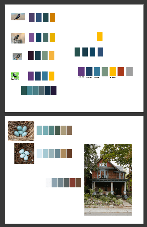
As I often do, I began by taking out my sketchbook, making a mindmap and preliminary sketches to get some ideas flowing. I also made a moodboard in Milanote and did some research on other community service organizations. I gathered images for inspiration – from the agency’s name and fictional location (photo by Erin Minuskin on Unsplash) – and looked at what other, similar agencies had done with their logos. I noticed a lot of calm, clean blues and simple, modern text and images.
I then went to Illustrator and started to experiment with different palette and font options, thinking about the logistical, aesthetic, and emotional elements of different choices.
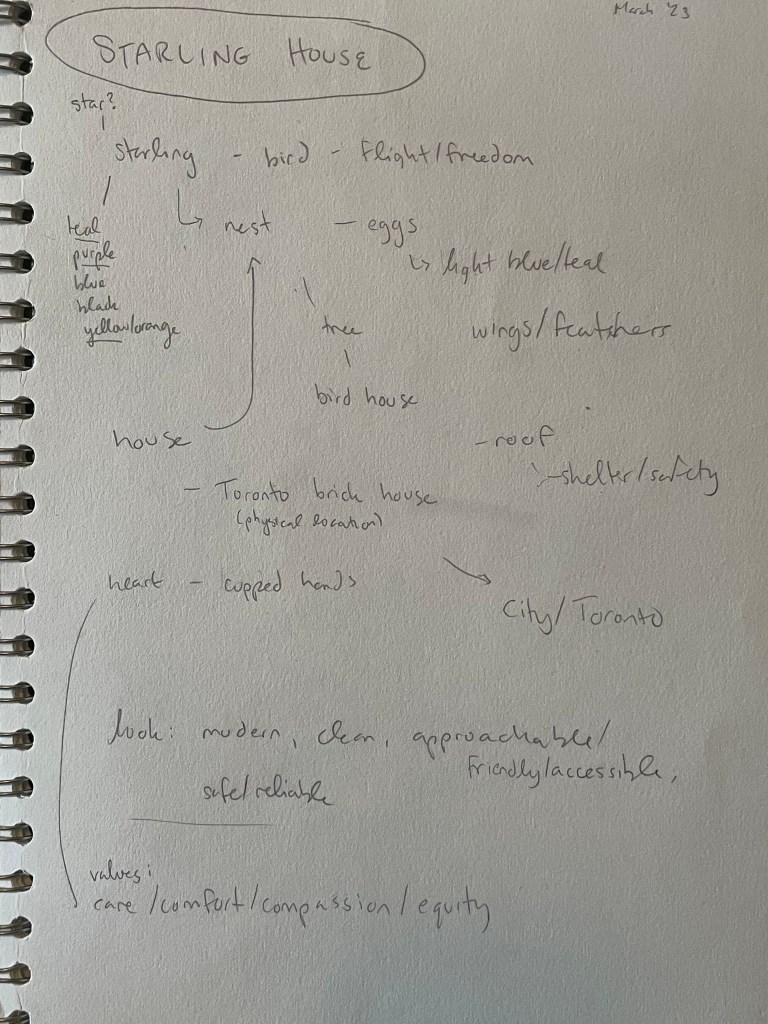

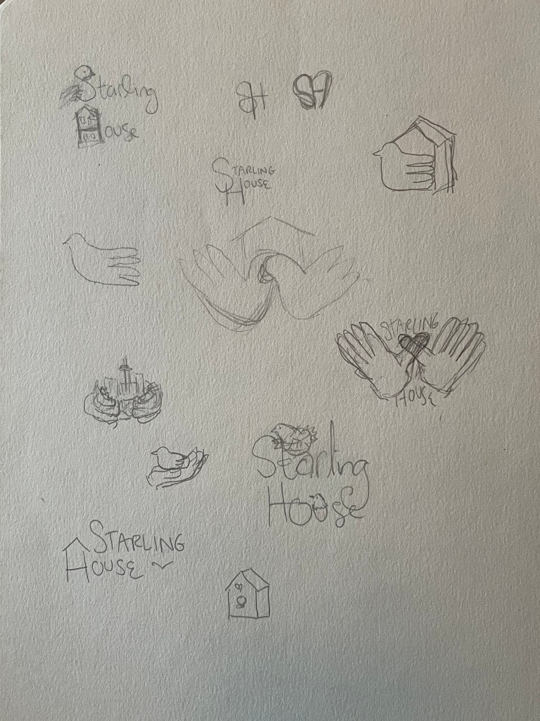

I settled on Montserrat for the logo typeface, which best fit the qualities I was looking for, and started to try some different layout options. I thought about what symbols or images to incorporate, and decided on an abstract starling. The starling worked with the organization’s name, of course, but the bird imagery could also symbolize freedom and life – ideal for an agency that helps people live free of mental health burdens. The bird’s beak is tilted up, evoking hope, and the shape is perched on a letter, as though at rest.
I also settled on a colour palette and some guidelines for logo use, which could later be put into a style guide.
The Results:
I made one long-form version for external use, which shows the full name of the agency, and one short-form version for internal use, which just has the Starling House initialism.
I really enjoyed developing a visual identity for this organization, and I’d like to produce a full style guide next.
Poster Design
Concept Project: Naloxone Awareness Transit Posters
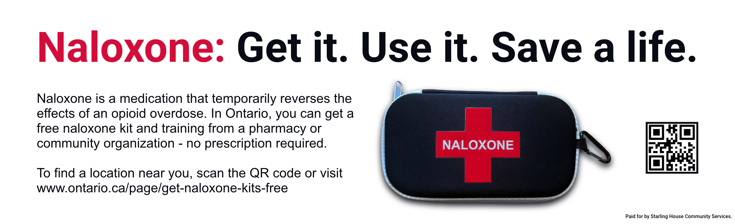
As another complementary project to the opioid overdose response training, I designed a transit poster series to raise public awareness of naloxone’s importance and availability.
Responsibilities: Graphic Design, Copywriting
Tools used: Google Docs, Adobe XD, Adobe Photoshop
Client: Starling House Toronto, the fictitious community service agency
Target audience: Riders of the TTC (Toronto Transit Commission), a broad swath of the Toronto public
The Brief:
Torontonians are acutely aware of the poisoned drug and overdose crisis ravaging their city. Many people know about naloxone, but not everyone knows how to get it or how to use it. I thought that Starling House Toronto, the fictitious client from my opioid overdose response training, might commission a series of ads to raise public awareness of naloxone.
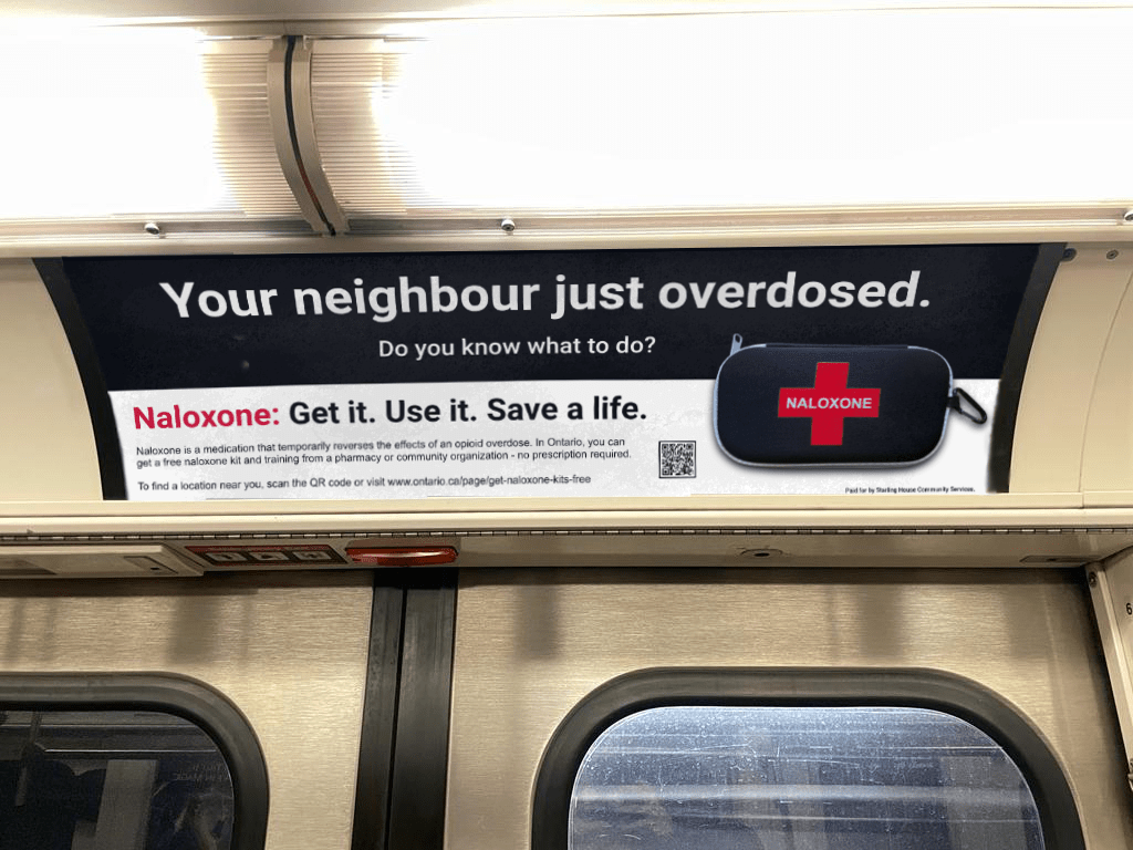
This poster series alerts people to the immediacy and usefulness of naloxone, and provides a link and QR code to help them get naloxone kits and training.
The Process:
I chose Adobe XD to draft the posters, as I find XD useful for quickly organizing different iteration “streams” and comparing small changes between versions.
After experimenting with and iterating on a few different vertical layouts, I sought feedback and selected the one with the strongest response. I then adapted it into two types of horizontal layout: one for single-poster placement, and one for alternating-poster placement (where repeated posters alternate along the length of a bus or a subway car).
While riding the subway, I took photos of poster locations, and when I got home, used them to make mockups in Adobe Photoshop.
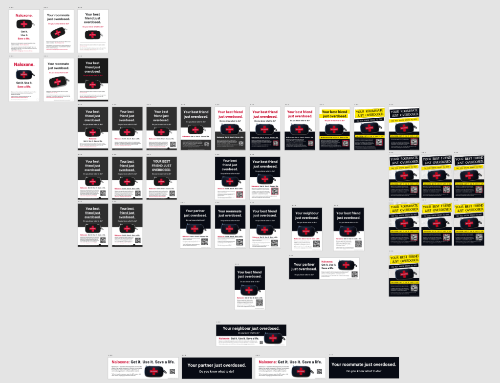
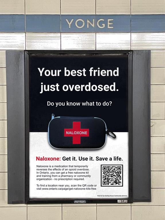
The Results:
All posters have the same elements, which together work to drive home the importance of naloxone and encourage viewers to get a kit and training:
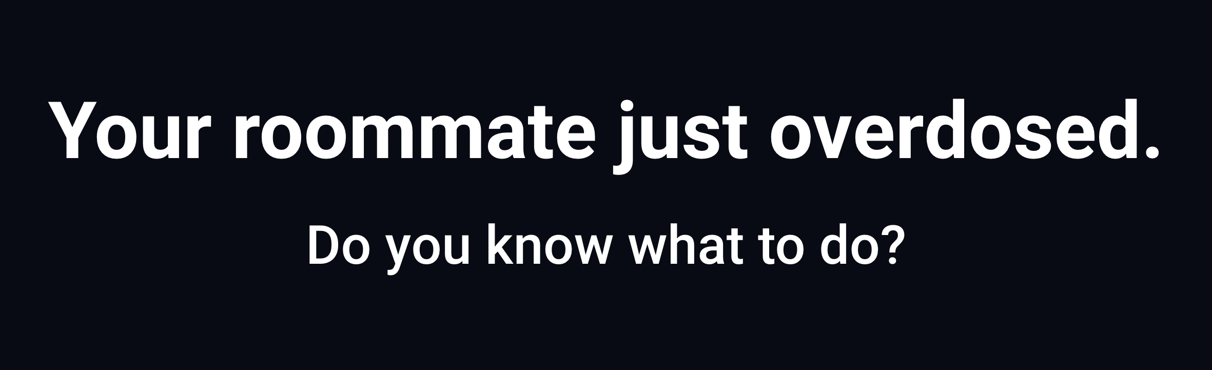
The stark, bold type at the top of the poster conjures a situation in which someone familiar to the viewer has just overdosed, highlighting the catastrophic and personal nature of overdoses. (Some posters say “neighbour,” some say “partner,” some say “roommate,” and some say “best friend” to recognize the diversity of people’s living situations).
The subtitle says, “Naloxone: Get it. Use it. Save a life,” reminding viewers that there is a solution and that they have the power to save someone’s life.
There is an illustration of a naloxone kit, in case viewers haven’t seen one before, and more information about naloxone’s use and availability in Ontario:
“Naloxone is a medication that temporarily reverses the effects of an opioid overdose. In Ontario, you can get a free naloxone kit and training from a pharmacy or community organization – no prescription required.”
With this phrasing, I aimed to reduce barriers by underscoring that training and kits are available for free (so money is not an issue) and with no prescription required (so no need to worry about paperwork or hassle). Finally, I included both a QR code and link to Ontario’s naloxone page, which has information about where to get naloxone kits and training.


Layout Design
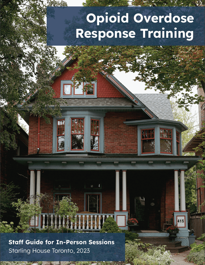
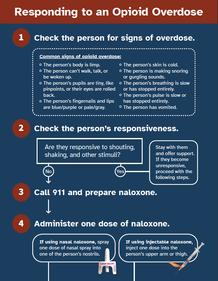
Opioid Overdose Response Training
For my opioid overdose response training project, I created a staff guide for in-person training and a reference flowchart for volunteers. When considering layout options, I paid special attention to the usability needs of each group:
- Staff needed distinct exercises with listed learning objectives and assessment criteria that could be checked off;
- Volunteers needed a clear roadmap of sequential steps with guidance on how to make decisions.
Annual Reports
During my time in non-profit communications, I helped develop annual reports for three local non-profits:
- 2019-2020 Annual Report for Native Child and Family Services of Toronto – contributed to layout design and copy
- 2018 Annual Report for Against Hunger Canada – contributed to layout design and copy
- 2018 Annual Report for Greenest City Environmental Organization – contributed to layout design and copy
Other Documents
While working with non-profit organizations, I also designed various organizational assets and internal documents, such as signs, Microsoft Word and PowerPoint templates, newsletters, social media graphics, and informational documents.
To illustrate that type of work, I developed a letterhead template for my fictitious client, Starling House:

